The first public website went live on August 6, 1991. By September of 2014 there were well over one billion websites in existence.
People have become very accustomed to the internet and expect sites to work a certain way. With that understanding, any discussion of the elements of intuitive website navigation must take into consideration the existing conventions.
Why Bother?
- Visitors can move around the website easily
- Shoppers find products and information without difficulty
- Users stay on the site longer
- Engagement and conversions are encouraged
- Search engine optimization is improved

Keep in mind, your website exists for one purpose only—whatever your reasons were for putting it up. The site’s job is to inform people, period. Whether it’s a product, a service or just general information, your goal is to impart information and make a sale, even if that’s just a shift in their attitude about something.
However, if you want people to engage with your site, you have to present it in a way that won’t tax them when they try to take it in.
In fact, it shouldn’t even feel as if they’re trying to take it in.
The Key Conventions
And yes, that is doable—when you adhere to these tenets:
- Clicking the logo (which should always be in the top left corner) takes users back to the home page
- The last link in a menu should be ‘Contact Us’
- Contact information should always be found in the footer,
- Key navigation elements are found in the same position on each page
- Links are readily distinguishable
- Scrollbars are visible whenever scrolling is possible
- Text should be aligned according to the language preferences of your ideal customer. (Western languages usually read from left to right, while some Eastern dialects read from right to left. Meanwhile, certain Asian languages read vertically.)

- Help messages and notifications become visible when hovering over an element
- Menus employ plain language such as “Contact Us”, as opposed to “Initiate Communication”.
In addition to keeping to those conventions you should:
- Make buttons easy to see
Users are attracted to clickable buttons. These are especially useful on mobile devices. Employ buttons often (but tastefully), keep their names concise and place them consistently on each page of the site. Size them to be optimal for touchscreen users.
- Do what’s expected
Primary and secondary navigation elements should be deployed exactly the same way on every page. Establish the pattern on your home page and keep it consistent throughout the site. When you give users what they expect to see they won’t have to figure it out every time they access a new page.
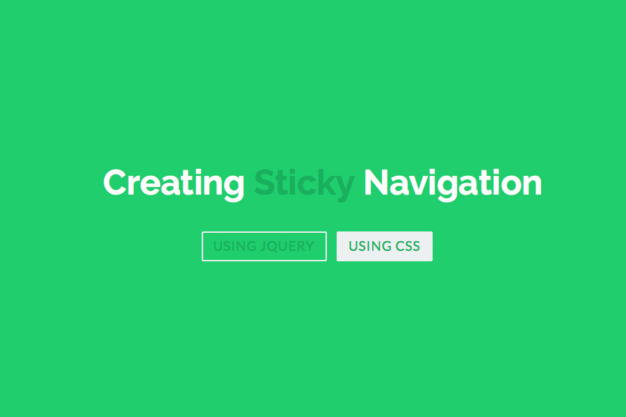
- Use sticky navigation
Keep the key navigation items in place when users scroll so they won’t have to scroll back up to access them. This helps eliminate visitor frustration.
- Leave breadcrumbs
Make it easy for visitors to return to pages they viewed previously; like, say for example when they want to take another look at a product on your ecommerce site.
If you’re considering putting up an ecommerce site and this seems like too much to absorb, the best free ecommerce website templates already take all of this into consideration. All you have to do is come up with your own color scheme and certain stylistic factors. The rest is already taken care of.
Conversely, if you’re hiring someone to build your site from scratch, any web designer worth their fee should already know these things and how best to implement them. In other words, ease of navigation is one of the criteria by which you should judge their work when reviewing their previous projects.
These elements of intuitive navigation should be solidly on display.
Find another designer If they aren’t.